COVID-19 academic recovery
Improving information architecture to help educators better understand students' needs after an unprecedented year.
Date February 16 to February 19, 2021
Tools Tableau, Sketch, Miro
Project overview
The problem
Academic disruptions caused by the pandemic impacted students across the country.
From its large databank of student assessment information, NWEA could provide state-level insights into student educational growth. The goal of this tool was to create visible data to help inform academic recovery efforts that would be necessary in the 2022 school year and beyond.
This data was being presented through Tableau, an interactive data visualization software with limited design capabilities.
My role
I was given access to the sandbox environment and three days to provide feedback to the stakeholders to improve the user’s experience.
I led the information architecture redesign, focusing on user research, low- and medium-fidelity wireframes, and accessibility updates. My work improved visual hierarchy, clarified content labeling, and simplified the user experience, ensuring educators could easily interpret and present the data. Additionally, I defended the inclusion of essential user guidance, enabling broader adoption and usability.
The opportunity
How might we improve the clarity of data visualizations to ensure users quickly understand the relationships and insights presented?
How might we reduce redundancy in data visualizations while preserving the richness of insights?
How might we leverage low-fidelity prototypes to effectively communicate architectural improvements to stakeholders?
Initial Cross-Sectional analysis designs
Initial Cohort analysis designs
Initial designs
User pain points
Design goals
Design challenge
The initial dashboard faced usability challenges, including a confusing hierarchy, a cluttered UI, and a lack of clear user guidance.
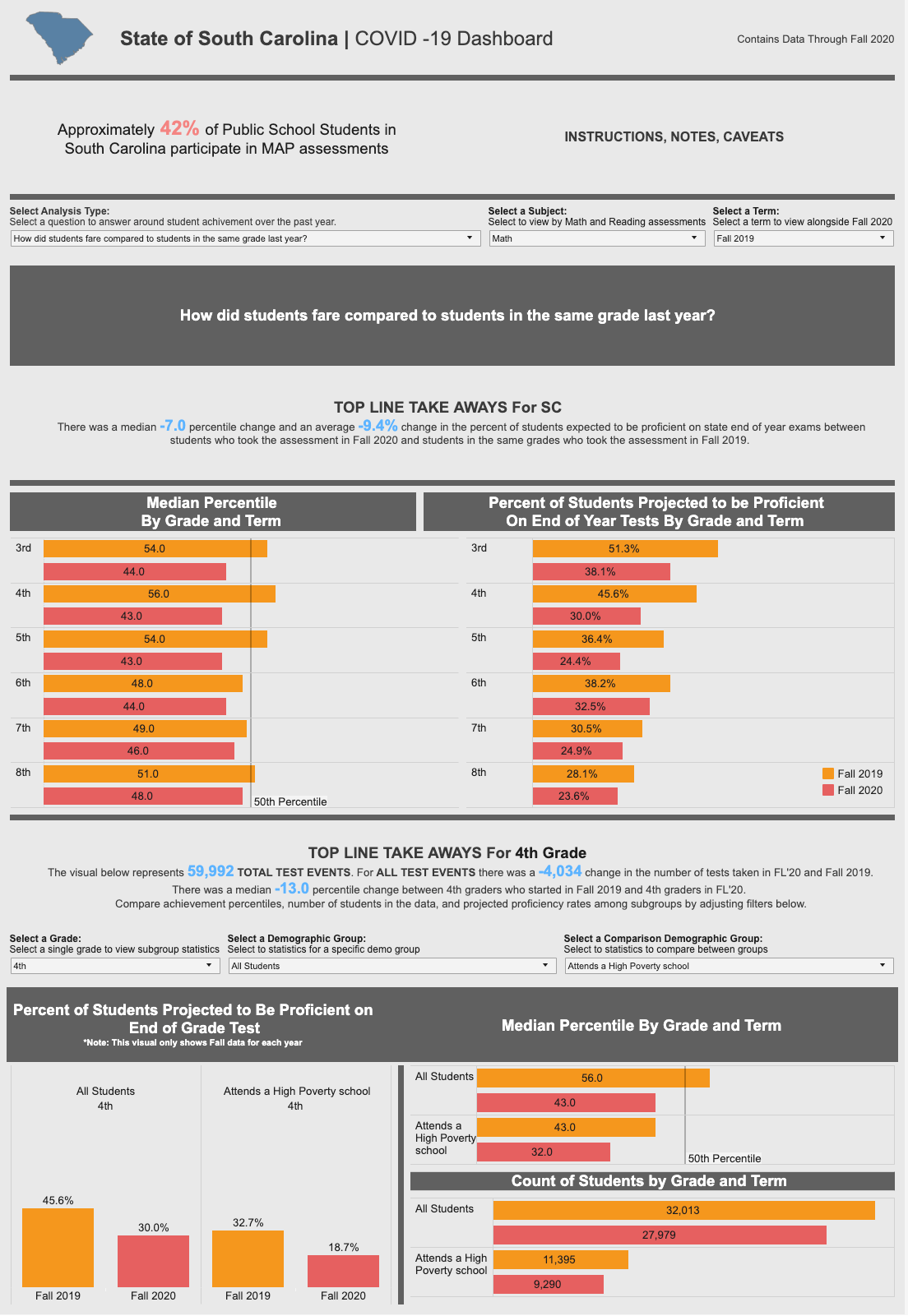
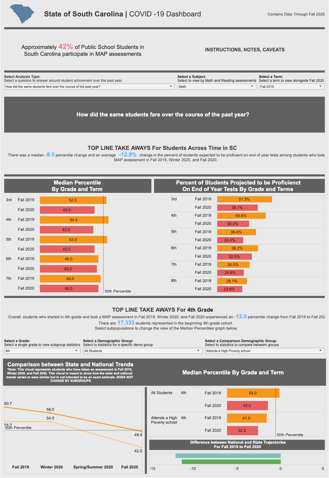
High-value data insights were navigated between via a <select> element that posited the data sets as questions to the user:
"How did students compare in the same grade last year?”
"How did students fare over the course of the past year?"
In the education industry, these reports have well-known names that weren't being utilized:
Cross-Sectional Analysis: Displays comparisons between current students and those from the previous year.
Cohort Analysis: Shows student performance over the past year.
These issues made it difficult for educators to derive actionable insights.
Utilizing company personas and peer testing, I identified three major user pain points with the current designs:
Confusing hierarchy
Users struggled to understand what data the selects controlled. When asked to find a specific data point, they couldn’t discover the pathway to generate the needed result.Unclear purpose
Users were unable to find actionable information from the data. "I don't understand what to do with what I'm looking at."Cluttered UI
Users were overwhelmed by the condensed layout. Many voiced their desire for a better utilization of a vertical scrolling to give breathing room to the design.
To address these top issues within the limited timeline, I established the following design goals:
Achievable Scope: Recommendations had to be feasible within Tableau's design limitations, focusing on color, font styling, and patterns.
Intentional Disclosure: Incorporate user guidance directly into the UI to reduce cognitive load, replacing hidden tooltips and repetitive labeling.
Improved Hierarchy: Present data in a progressive order, ensuring output data follows a logical sequence from the controls influencing it.
UI improvements
How might we maximize improvements by utilizing existing tooling?
Design system quick wins
Color accessibility
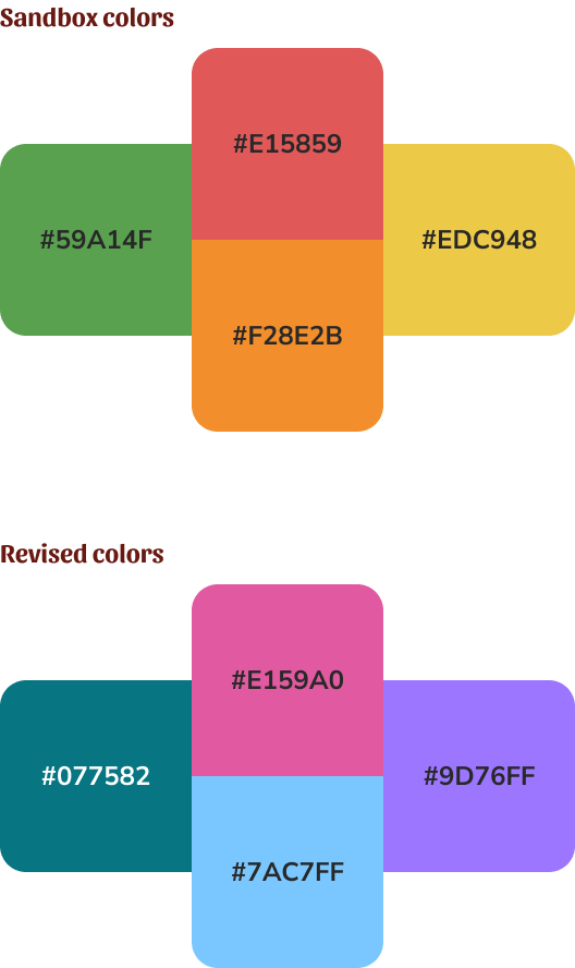
The sandbox design used red, orange and green to visualize the user selected data.
In addition to carrying the weight of being “feedback” colors, communicating errors, warning, or success, these colors ran the risk of appearing nearly identical for any user with a color deficiency.
To solve this problem, in addition to pushing for the use of improved labeling, I ran design system color values through several accessibility toolkits.
This included visualizing what the colors might look like presented next to each other with various color blindness. I created a list of color values that would still appear different when presented next to each other, regardless of a user’s color interpretation.
Content updates
Leveraging our company’s design system, I was able to rapidly outline simple UI improvements that aligned the data with our organization’s visual language.
Typography Styling: Standardized headings, labels, and body text for uniformity.
Text Alignment: Reduced center-aligned text and optimized line length for readability.
Section Headers: Updated for better printability.
Consistent Labeling: Applied uniform patterns for selectors, visual displays, and tooltips.
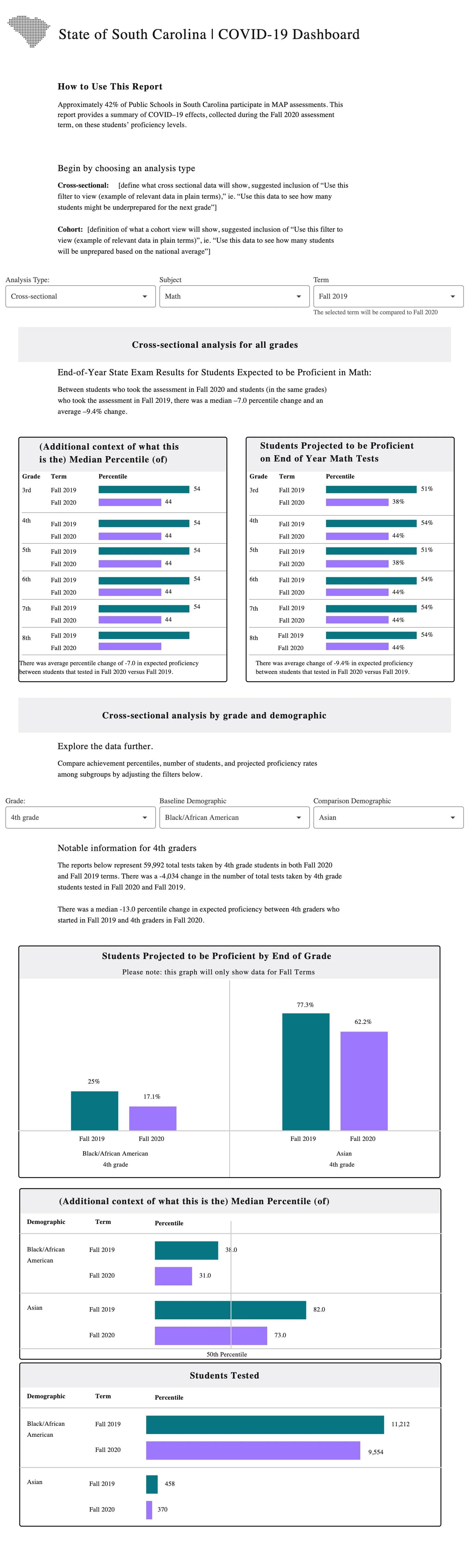
Usability challenges also stemmed from content written with the assumption of user familiarity. Recognizing that end-users would present this data to diverse audiences, I advocated for revisions to simplify language and context, making the information more accessible and actionable for all stakeholders.
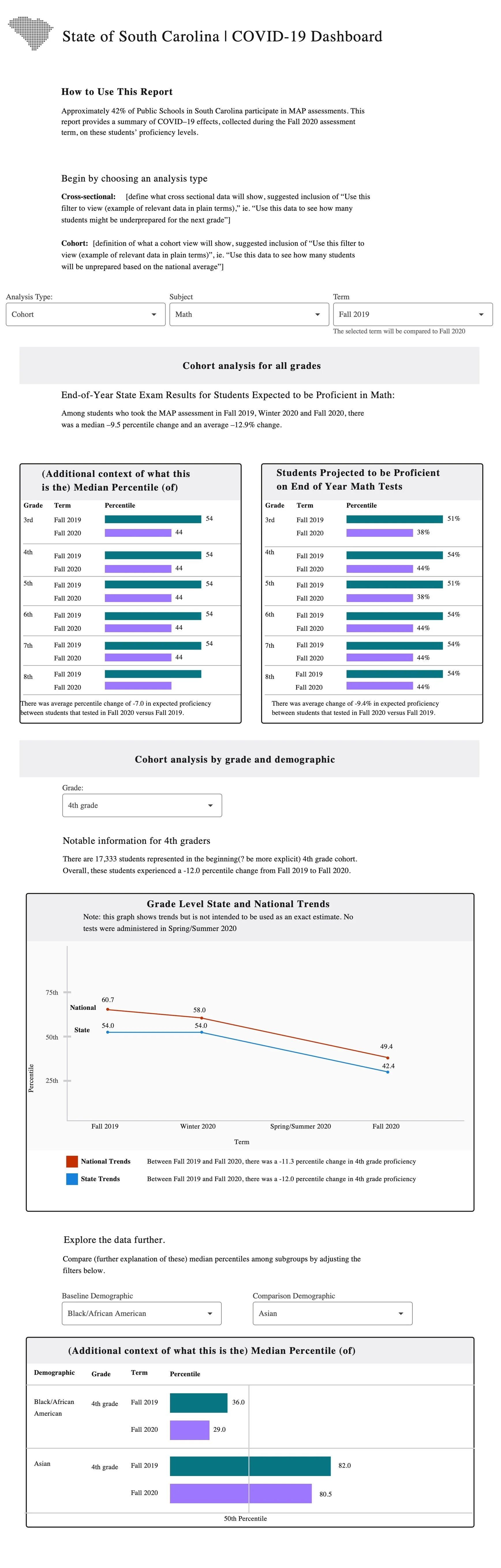
“There was a median -9.5 percentile change and an average -12.9% change in the percentage of students expected to be proficient on end of year tests among students who took MAP assessment in Fall 2019, Winter 2020 and Fall 2020.”
“Among students who took the MAP assessment in Fall 2019, Winter 2020 and Fall 2020, there was a median –9.5 percentile change and an average –12.9% change in expected proficiency.”
Through these targeted interventions, the dashboard's usability and accessibility were significantly enhanced, empowering educators to better understand and address students' academic needs in the wake of the pandemic
Architectural analysis
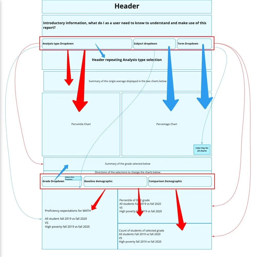
The final challenge was redesigning the architecture of the reports.
This would require more time investment from the stakeholder, but the value was more than to the effort it would take. To show the stakeholder the value of investing time in improving the report, I created a low fidelity wireframe of the prototype in its current shape to show the relation of data in each report view.
Cross-section analysis architecture
The cross sectional architecture progressed in a relatively natural order. The opportunity for highest value improvement was by creating a more spacious layout for the final demographic comparison reports, and improving the labeling of content to show its relation to the data selection.
Cohort-analysis architecture
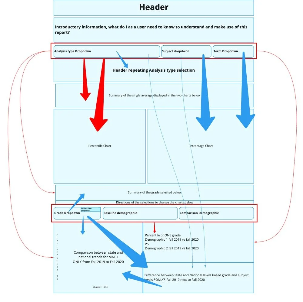
The cohort analysis had greater opportunity for improvement. Through the architectural mapping, I discovered that demographic data visualizations included redundant data sets, presented in a line chart and bar graph. Following data visualization best practices, I recommended the elimination of the bar graph in favor of the line graph as the data points were being displayed over time.
Architectural redesign
Using the discoveries from the architectural mapping, I was able to make informed updates to the layout of the reports. I created a set of updated wireframes to help visualize the future state of the prototype.
This activity helped to further improve the labeling of data. By seeing the prototype at its lowest fidelity, I could clearly see where data needed additional labeling to ensure the user knew what selections were informing the visualizations.
Stakeholder pass-off
I developed a set of updated wireframes and medium-fidelity mockups, which helped stakeholders understand the value of improving data architecture and labeling.
Implementation
Over the course of the following weeks, I consulted with the stakeholder as they made updates to the Tableau prototype. Due to the architecture of Tableau which required consistent formatting of the layouts between the two data sets, some layout updates were not possible to make.
A personal win for me, however, was in defending the value of having user guidance for the prototype. My stakeholder received pushback from his peers, who wanted to return the “How to Use” guide to a hidden tooltip. With fervent advocacy for the user, this information was kept exposed in the final product.
Once made publicly available, the report received positive feedback, being cited in several educational publications regarding the long term impact of COVID on student growth.
Looking forward, my stakeholder plans to expand the report to display more data sets. To support this, I will be conducting additional audits of color values to provide a larger library of hex values to work with while ensuring color-blindness accessibility.