Designing a hybrid HTML select component
Creating a scalable, user-friendly dropdown solution that balances design flexibility with native accessibility to meet diverse product needs.
Date May - July 2021
Tools Sketch, Miro, InVision
Project overview
The problem
Inconsistent design and conflicting expectations around dropdown components in our design system created usability and accessibility gaps, highlighting the need for a clear, standardized solution.
My role
I led the design of a hybrid HTML select component, collaborating with developers, stakeholders, and the Accessibility Committee to ensure usability, accessibility (WCAG standards), and scalability across our design system.
The opportunity
How can we design a dropdown that balances aesthetic customization with native functionality, ensuring accessibility, usability, and scalability for both current and future product needs?
Why drop downs
Context
Each year, the NWEA UX team conducted a card sort to identify and prioritize gaps in our design system. Drop downs consistently emerged as a top priority, but it became clear that designers had differing interpretations of what the component should entail.
Discovery
To address team misalignment, I first needed to define the drop down component we required. Speaking with each designer, there was a range of functionality described:
Disclosure navigation (links to pages)
Refinement (filters affecting content)
Data entry (form selections)
Action (triggering effects)
Non-list widgets (complex elements)
Auditing the drop downs across our products, I sorted them into three categories:
Selects for data submission
Menus for actions/navigation
Complex Widgets for advanced use cases
Select
Complex widget
Menu
User Research
User Research
I expanded my research by exploring global design systems, particularly government websites committed to WCAG compliance. I found that 31% of custom dropdowns had accessibility issues, which reinforced the need for a focus on usability and accessibility in our design.
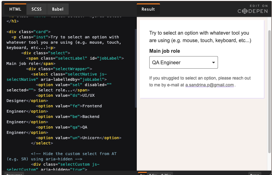
I also discovered a hybrid select solution by Sandrina Pereira, which blended custom styling for mouse interactions with native functionality for keyboard and assistive tech use, inspiring our design approach.
Design
Crafting the component
I started by aligning the select trigger with our recent form field styling, maintaining a consistent color palette and active states. The main challenge was designing a functional and user-friendly custom dropdown menu.
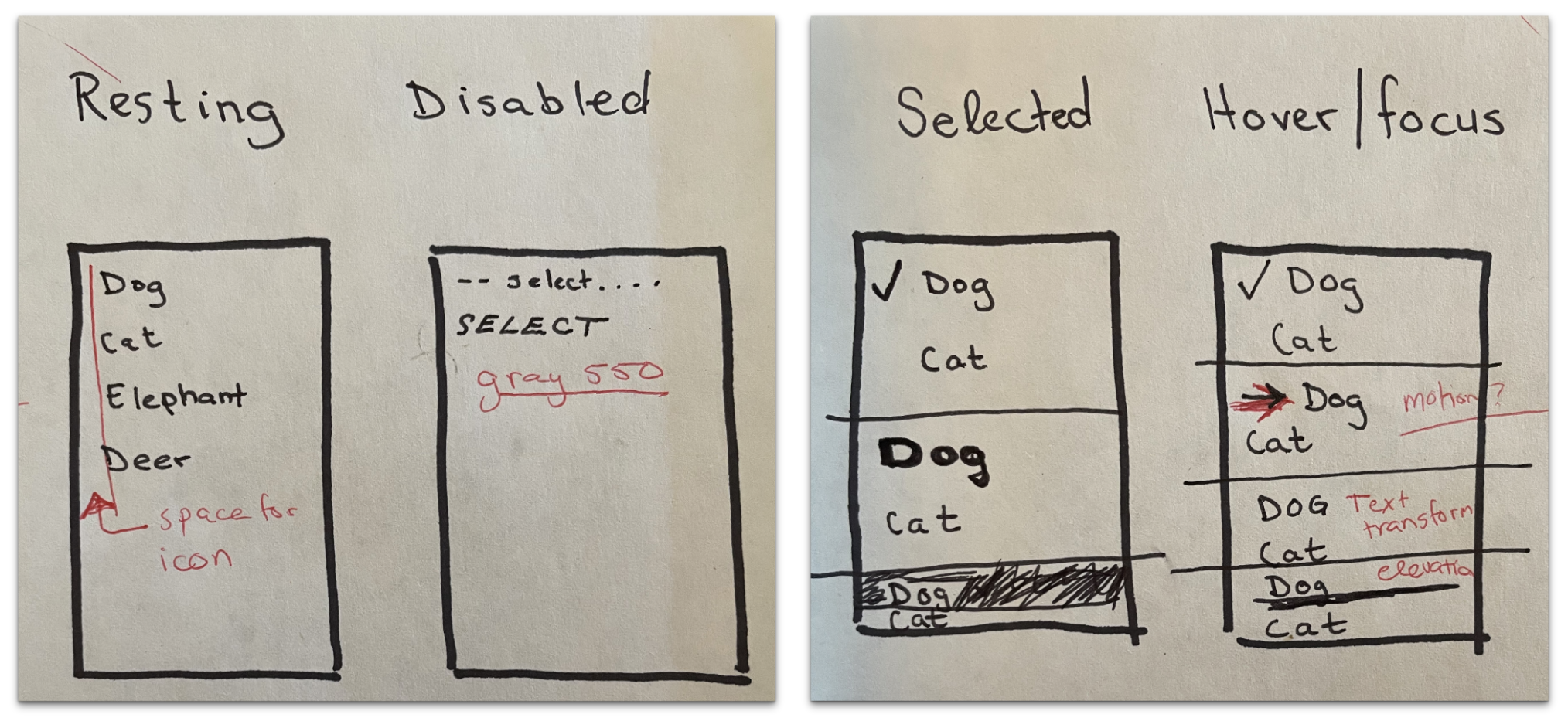
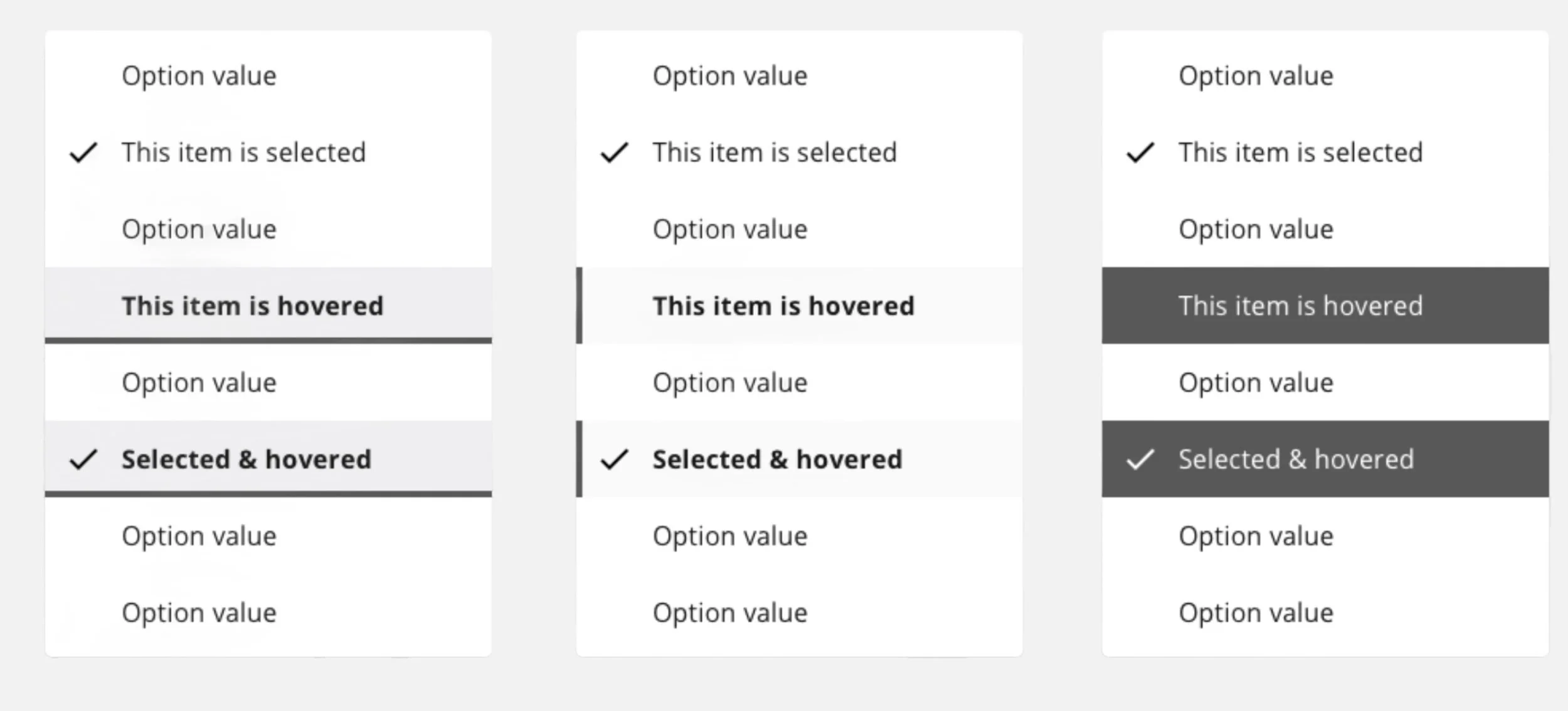
Key interactive states included:
Resting: Default appearance
Disabled: Gray-colored items for accessibility
Selected/Hovered/Focused: Text transformation and motion (minimized motion for neurodivergent users)
A challenge arose with focus styling, where users struggled to identify the focused item. To resolve this, I increased contrast in the hover and focus states, inspired by native select components.
Deliver
After finalizing the design, I collaborated with our design systems engineer to implement the select component.
Component Requirements: I outlined key design and accessibility decisions, sharing them with the Accessibility Committee for review.
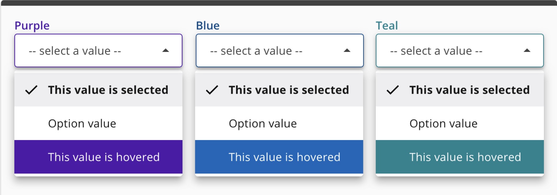
Styling: The design followed atomic principles, using consistent hover/focus highlights and themed colors for a unified experience.
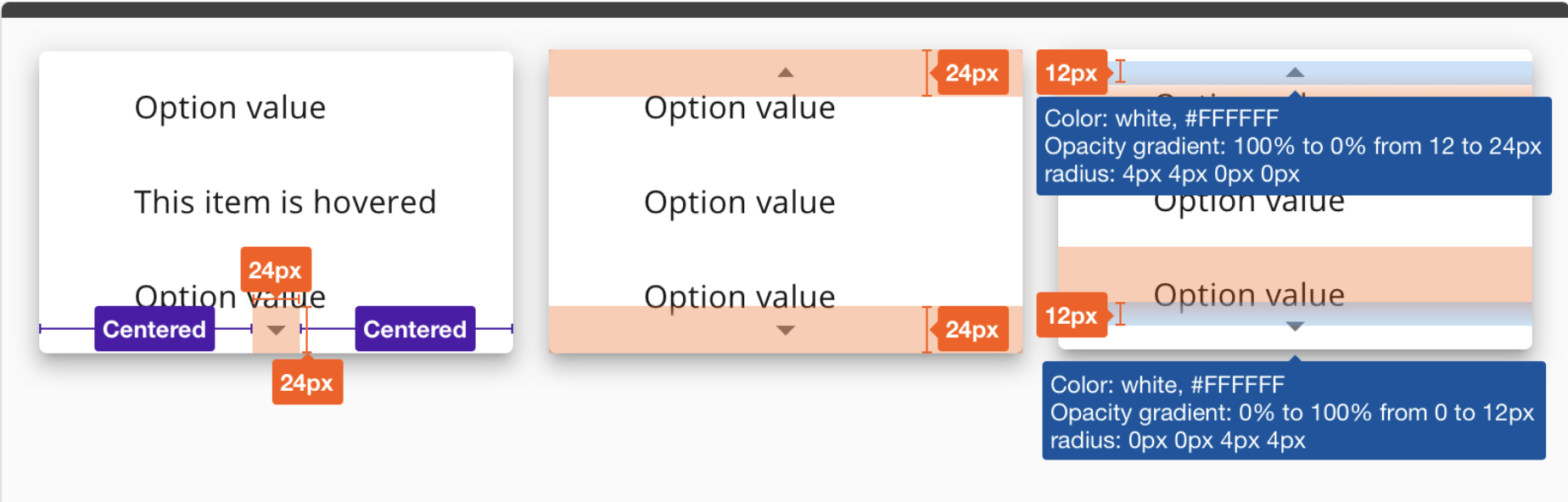
Readability: To improve legibility, I set a maximum width of 604px and ensured WCAG AA-compliant touch target sizes (list items at least 48px tall).
Content Disclosure: To reduce cognitive load, the dropdown displayed 10 items at a time with a scroll bar. When the fixed scroll bar failed, we adapted the design to use styled indicator overlays mimicking native behavior.
Impact and outcomes
Released in November 2020, the component:
Increased accessibility: The select now catered to both keyboard users and those relying on assistive technologies, improving NWEA’s compliance with WCAG guidelines.
Consistency: The hybrid approach harmonized custom dropdown functionality while maintaining familiar, native interactions.
Usability: We avoided the pitfalls of the 31% usability failure rate seen in other custom drop downs.
This project not only strengthened our design system but also brought a strong focus on usability and accessibility.